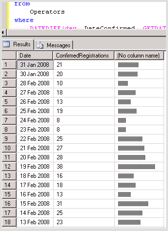
I recently blogged about a technique for generating charts in your raw SQL. It occurred to me that these are a little bit like SparkLines. So, I'm calling them SQL Sparklines for now!
According to Tufte, attaining a high data/ink ratio is a good measure of effective communication. So here's another attempt using less ink, and also showing some more data.
Comparing Uses who registered on a site, to those that actually confirmed their registration
See the a raise in the bar to show where the value falls on the scale? This is possible using the SQL Stuff statement. See below:
select
    Convert(varchar(12),DateCreated,102) as Date,
    cast(count(DateConfirmed) as varchar(4)) + '/' + cast(count(DateCreated) as varchar(4)) as [C/R],
    cast(stuff(replace(space(count(DateCreated)),' ','_'),count(DateConfirmed),1,'-') as varchar(50)) as Chart
from
    Operators
where
    DATEDIFF(day, DateCreated, GETDATE()) < 60
group by
    Convert(varchar(12),DateCreated,102)
order by
    1 desc
I've used ISO date formatting to get a good text sort order.
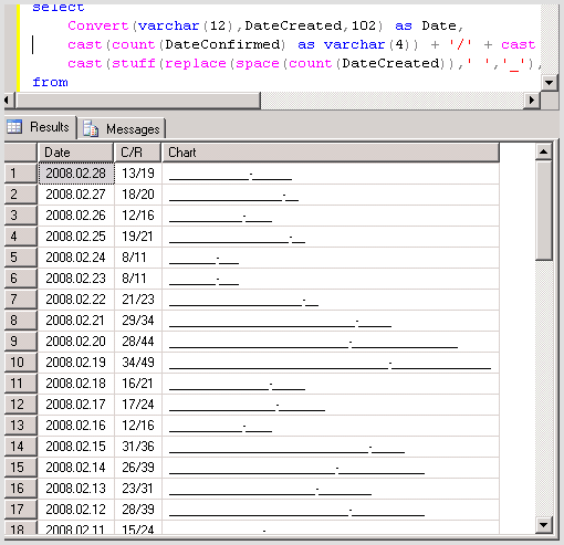
The new version (above) of the chart is less pretty than the old one (below), but is it more effective at communicating? I'm not sure!
The Original Bar Chart Version
T